My rebrand process
A Spoonful of Sugar and Co UK kind of happened, I knew I wanted to do something creative as an outlet from my day job as a Creative Director at a small design agency. I was also just coming up to maternity leave for the birth of my son so it seemed like the perfect time. To start with I had no vision or purpose. I just created what made me happy. This was fine to start with, but I found it became harder as it went on, I was being pulled into too many different directions and I didn’t know what I was trying to achieve. Then after nearly 5 years I realised I needed to sort it out and go back to the beginning and work out the foundations.
It started with a plan
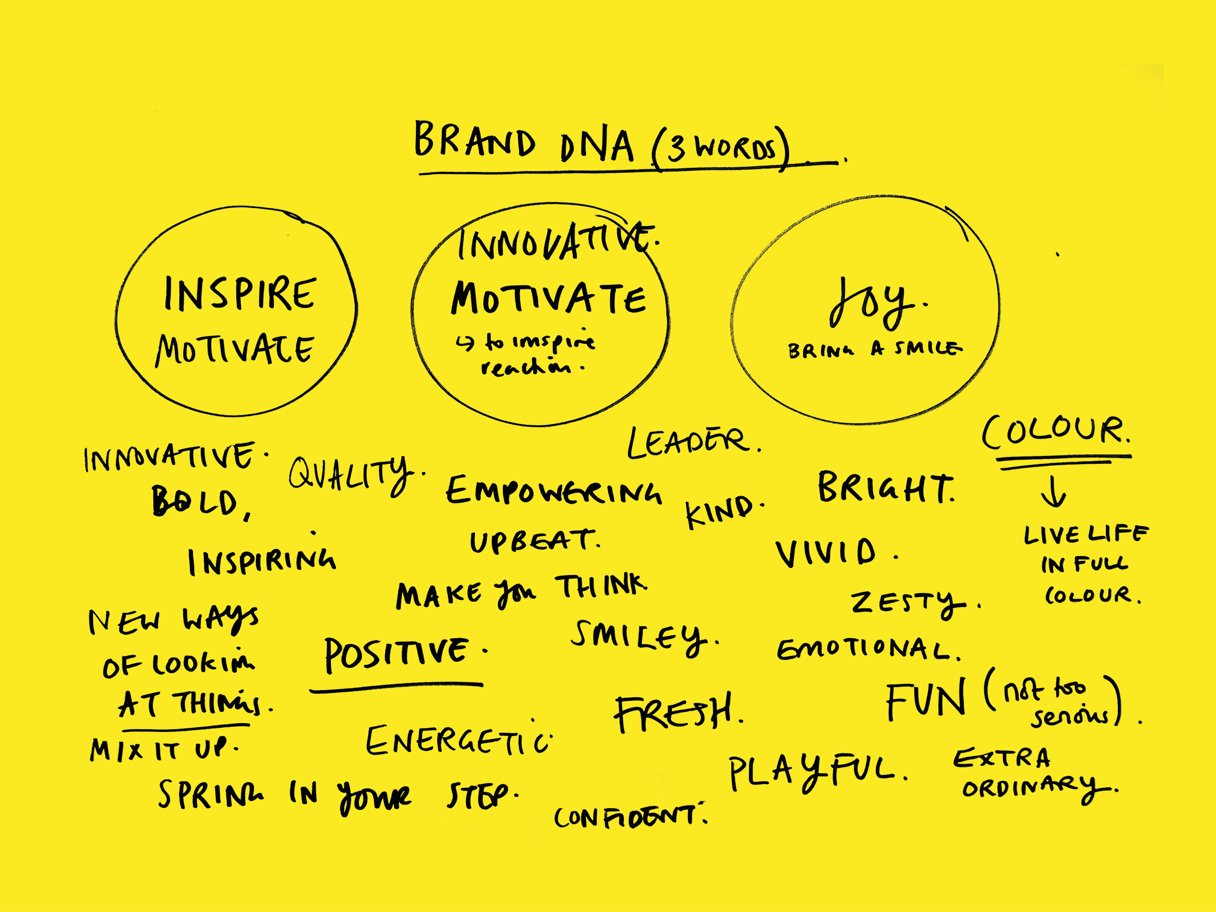
I had done a load of research and read a few books, but ultimately I needed to go right back to the beginning and work out what I wanted to do, Why was I doing this? What was I trying to achieve? What’s really interesting is that this is something I do all the time for other brands as part of my design agency tickety boo creative, but it’s always harder when you do it for yourself. I got 2 large sheets of paper (yellow of course) and wrote on one what I wanted out of what I was doing and what I believe is my brand DNA. The biggest decision I made was to lose my brand name, for me it didn’t represent where I wanted to go. My gut was telling me to just be me, my name ‘Judy Andrews’. About 2 years ago I met Leona from Indie Roller at Blogtacular and she asked me back then, why I wasn’t just my name, I’ve obviously had that in the back of my mind ever since.
My vision
This led me onto defining my ‘Why’ I actually got the support of my team at tickety boo creative, helping me refine and define my thoughts. I eventually distilled it down to…
To make others smile, think, feel inspired and believe that anything is possible
Recently I read ‘The Infinity Game’ by Simon Sinek (I’ll write a book review soon)
And it inspired me to have more than a why, but to have a just cause too. Something that is bigger than me, something I always strive to achieve with everything I do. What is brilliant is that it fits with both my art and my design agency.
To inspire and empower others through creativity
Refining my designs and products
Over the years I’ve designed many things for my shop including lavender bags, lavender monsters, friendship bracelets, hand painted jewellery, digital prints and much more. I have spent the last couple of years refining, but it was still too varied which didn’t help with my focus. I’m now going to concentrate on Typographic/graphic Risograph prints, T-Shirts and I’m currently working on a new jewellery range. I’ve also refined my aesthetic, which was a tough thing to do, but I need to be disciplined and it will make my work stronger because of it.
A page from Austin Kleon, ‘Show your work’
More than my art
I knew that I wanted to do more than create and design, I wanted to inspire by sharing my thoughts, what I’ve seen and learned. So this led to me starting a blog, I have 3 streams
JOURNAL - for all my personal thoughts, achievements and my story
INSPIRATION - sharing things I’ve see, exhibitions I’ve been to, showcasing creatives I admire
BOOK CLUB - I discovered a love of reading around my 40th birthday and want to share books l’ve loved and what I’ve learned
My logo
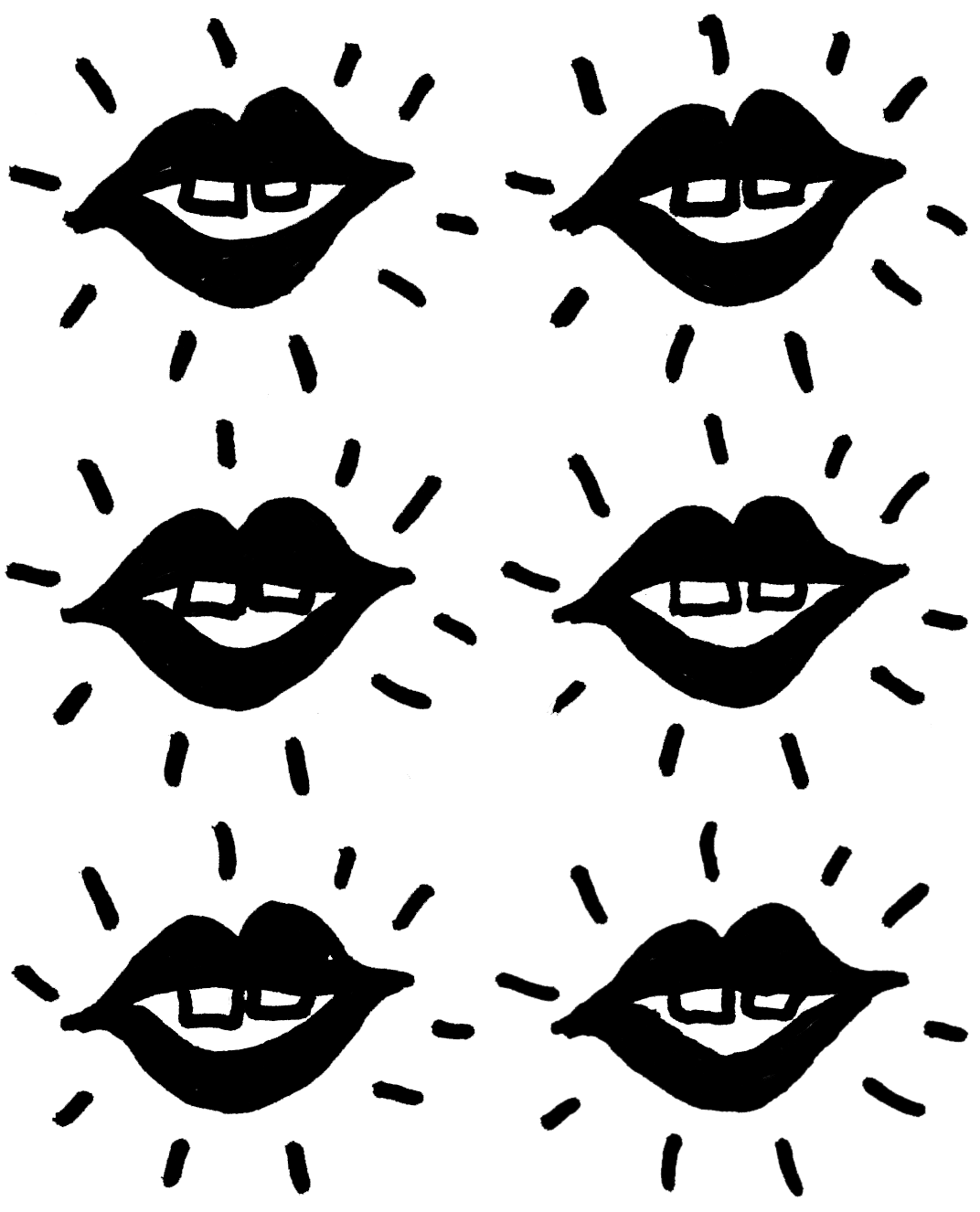
I really had fun with this one, I wanted something that was really uniquely me, I was inspired by ‘I am my brand’ by Kubi Springer, it was a really helpful book and made me think about myself and my brand in a different way. It also had exercises in there where you answer questions and it really helps tease out a creative direction. So I just started sketching in my sketchbook (where all my ideas start) and it was almost the first doodle I did, my mouth and my distinctive teeth, with the expressive rays around to express me finding my voice. I did draw some more refined options but loved how raw and playful the original sketch was.
My supporting visual toolkit
I always love a moodboard, so this is where I started, I knew I wanted something bold, vibrant and very graphic to reflect my work and personality. And in terms of colour I knew I wanted to retain the yellow as it’s my favourite colour and has such positive connotations. I also introduced supporting bright neon colours (I grew up in the 90s). I wanted it to be confident but not compete with my designs.
My website
I worked with my team on the website, they brought with them exciting ideas of how to bring my vision to life. Looking at animation and how the brand develops on a digital platform. I wanted it to be simple and clean so the work shines, but also to have bold colour and graphics in the more inspirational sections of the website.
The result
I’m so very pleased with how it all turned out, I feel like I have now future proofed my brand as I now have a strong vision and creative direction. It’s even inspired me. I find that now I’m more focussed I can explore new ideas in more depth, which will ultimately make my work stronger and more meaningful.


