My 365 days of type
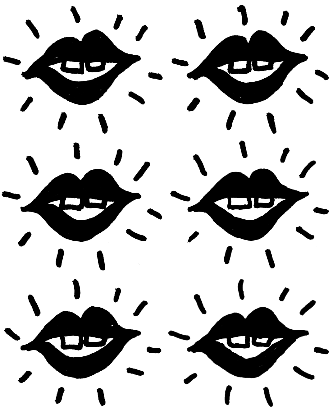
In April 2017, I decided to take part in The 100 day project by Elle Luna and Lindsay Jean Thompson. The idea was to release my creativity, get me to experiment more and try and draw every day. My chosen theme was 100 days of typographic doodles. I wanted to develop an already strong passion for hand drawn typography. My aim was to be more playful and push myself by adding in some simple illustrations, I used just pen and most were in black and white. Experimenting with different techniques and approaches made me hungry for more, so not long after this, I dived head first into the challenge of 365 days of type.
My weekly themes
It was important for me to have structure, and parameters so there was a weekly theme. I wanted to experiment, explore new ideas and techniques all with the bigger aim to inspire and motivate others. The themes included wisdom, friendship, typographic grids, disco, movies, love and fashion. Each week I’d explore the theme and create a piece of artwork a day. Some days I found it a real challenge, especially working full time and looking after my little boy - and I definitely enjoyed some weeks better than others. Coming up with content for each of my designs was the hardest part. The themes definitely helped with this, I also researched the themes for inspiration, also getting inspiration from everyday life and sometimes friends & family.
For the love of colour
Another difference between the 100 day project and the 365 days of type, was colour. I had a lot of fun playing around with colour combinations. Sometimes playing around with several colour variants. I definitely had my favourite colours, and have realised I much prefer bold vibrant colours to soft muted colour palettes. I also loved playing around with more vivid colours by using RGB rather than CMYK.
Playful animations
As the weeks went on I became braver and started to experiment with animations too, just simple gifs, but again it made me think about my designs in a different way. Some of them built the message, which made it stronger and some enhanced the final design. I made my animations in photoshop by exporting my design in different frames.
Reflection
I'm so glad I did the project, it's helped me with new ways of thinking, new ideas, took me out of my comfort zone and most of all I had fun. I turned some of my favourite designs into prints and T-shirts to sell in my online shop. I’d love to do another challenge, to continue to push myself and do more experimentation, watch this space!


